Been awhile. The holidays and then start of school. But things are settling down—a bit.
I teach a class in typography and whenever I cover a subject I see examples of it and its abuse everywhere. I’ve been covering the use of quotation marks, apostrophes and prime or hatch marks.
(Prime marks are straight up and down and are used with numbers to indicate inches or feet. Quotes and apostrophes are curved or slanted, depending on the font. )
They are used incorrectly so often that people have begun to accept them when they would not accept a straight up and down comma. (Hopefully!)
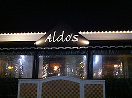
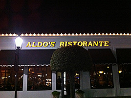
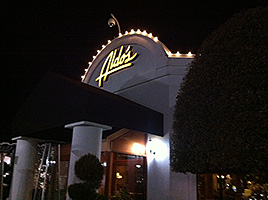
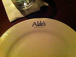
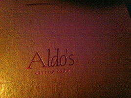
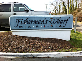
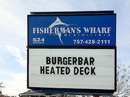
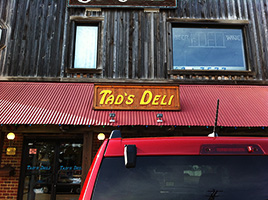
It was my Mom’s birthday and we took her out to dinner. The food and service was very good but the typography was all over the place. The other samples are within a few blocks of her condo. So, Type Geek had to document them. (click image for larger view)

